Commons:Featured picture candidates/File:Bison skull pile edit.jpg
From Wikimedia Commons, the free media repository
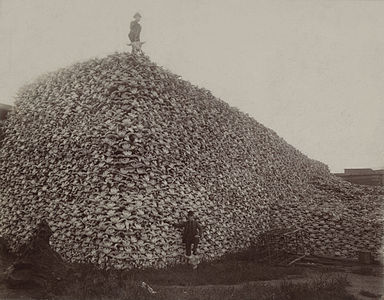
File:Bison skull pile edit.jpg[edit]
Voting period is over. Please don't add any new votes. Voting period ends on 3 Jul 2011 at 10:14:05 (UTC)
Visit the nomination page to add or modify image notes.
 Info created by Unknown - uploaded by Chick Bowen - nominated by Citron -- Citron (talk) 10:14, 24 June 2011 (UTC)
 Support -- Citron (talk) 10:14, 24 June 2011 (UTC)
 Neutral
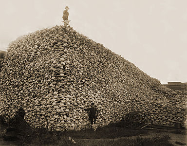
- Maybe this version is better?--Citron (talk) 13:03, 24 June 2011 (UTC)
- Yes, actually, I prefer that version much better. Looks like they got rid of a spot in the middle of the shot as well (though one of the skulls on the far right goes missing, unfortunately). Much brighter. I would support the alternative. – Kerαunoςcopia◁galaxies 22:19, 24 June 2011 (UTC)
 Neutral You know what, I retract my previous statement. I'm leaning toward the original now. I can't find the en.wiki FPC comments for it (someone didn't get the link right), but while I really appreciate the brightness of the alternative (and thanks for putting it up), PawelMM really messed with the contrast and you lose so much detail. I was flipping between the three images (original, restored 1, and restored 2) and I think I really do prefer the restoration resembling the original tone the closest. Brightness was really my concern, not contrast, and certainly not the lack of color (both add varying degrees of old newspaper yellow coloring). PawelMM's (alternative) restoration has one thing going for it: the nasty spot in the middle of the skull pile. Maybe I'll give my hand at removing it on the original nomination; PawelMM erased some detail in removing the spot, and it could probably be done without that happening. But the alternative restoration, like I mentioned above, has some skulls gone missing on the right side, and you know, that's really an absolute no-no, because they did not need to be removed; I should've realized that, for an FP, this is a serious matter. So, for now, I'll prop myself back on the fence. – Kerαunoςcopia◁galaxies 12:21, 25 June 2011 (UTC)
- Sorry, link now fixed. --ELEKHHT 07:36, 26 June 2011 (UTC)
- Ah thanks! Yeah, looks like one person said what I was thinking: I'm actually leaning toward the original nomination, but it could still use a little more cleaning I guess. My only concern is the ugly spot in the center. I would probably try my hand at it, but I'm not sure how accepted it is to alter images any further while nom'd (I wouldn't upload a deriv, it'd be an overwrite) and after it's already qualified for FP elsewhere. – Kerαunoςcopia◁galaxies 13:43, 26 June 2011 (UTC)
- Sorry, link now fixed. --ELEKHHT 07:36, 26 June 2011 (UTC)
- Yes, actually, I prefer that version much better. Looks like they got rid of a spot in the middle of the shot as well (though one of the skulls on the far right goes missing, unfortunately). Much brighter. I would support the alternative. – Kerαunoςcopia◁galaxies 22:19, 24 June 2011 (UTC)
Alternative[edit]
 Info created by Unknown - uploaded by Kaldari - nominated by Citron
 Info I recall that this picture dates from 1870 --Citron (talk) 10:22, 25 June 2011 (UTC)
 Support

